Project Background
Chang's Garden is one of the oldest Chinese restaurant located in Storrs, Connecticut. As they are located right next to the University of Connecticut (UConn), most of their customers are college students and their family members.
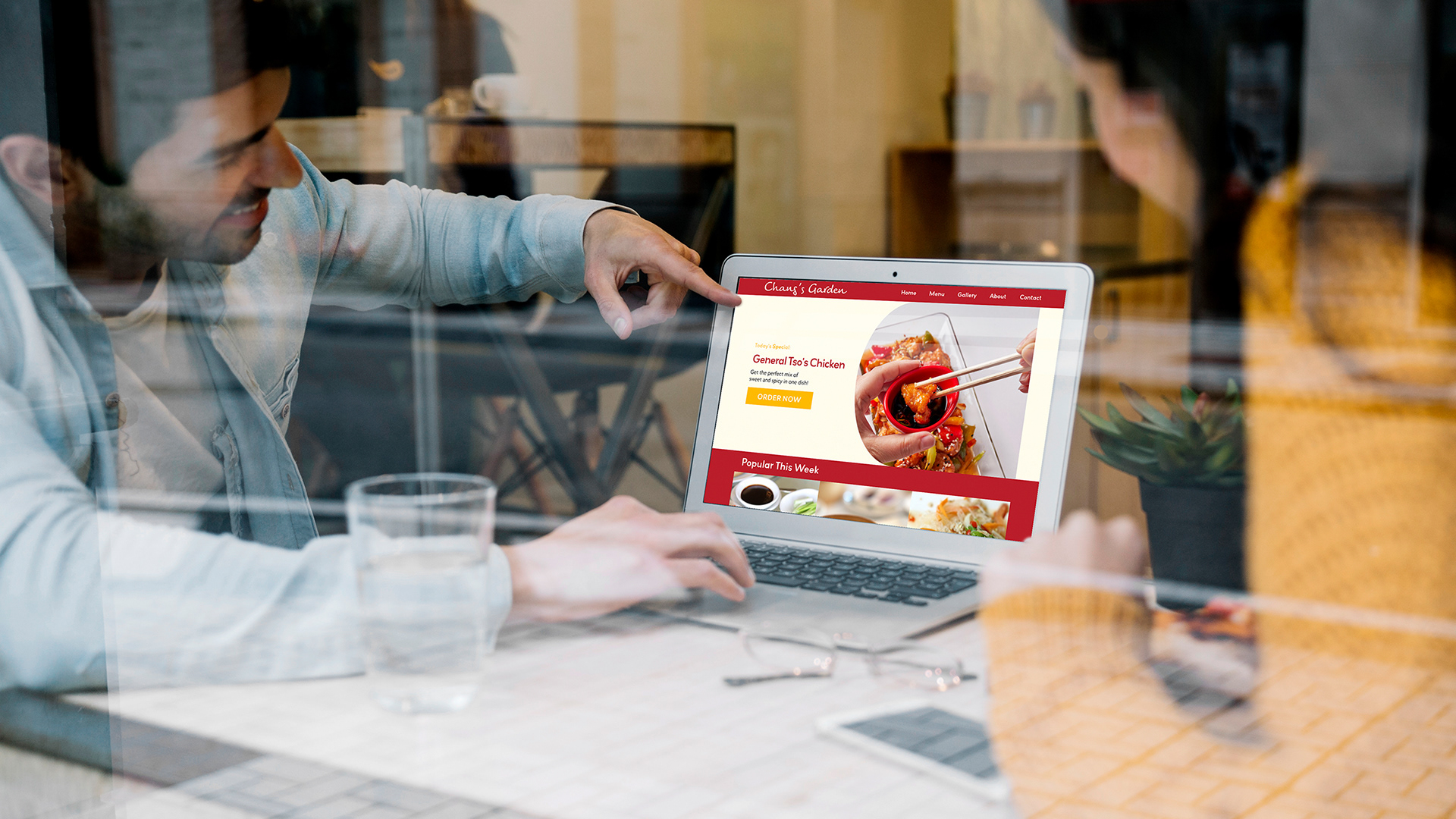
This project was done during one of my University courses in Web Design where we learned HTML and CSS. My focus in this class (besides learning HTML and CSS) was to study how to make it easier for users to navigate through a website.
The Interview
Initially Chang's Restaurant told us "the website is very old and we need a new one." Although I could see that their website was indeed old, I wanted to dig deeper into why exactly they felt like they needed a website. After interviewing them, I learned that despite being a well established restaurant in the University, at the beginning of each semester, they would have a drop in sales due to new students and customers not being familiar with their menu offerings.
Website Redesign Goals
After the interview together with Chang's Garden we agreed that our focus for the new website would be to it easier for their customers to try out new foods at their restaurant and helping them get familiar with the menu so that they are less intimidated to make their orders online.
Roles
Researcher
UI Designer and
Information Architect
UI Designer and
Information Architect
Tools
- Adobe XD
- HTML
- CSS
- HTML
- CSS
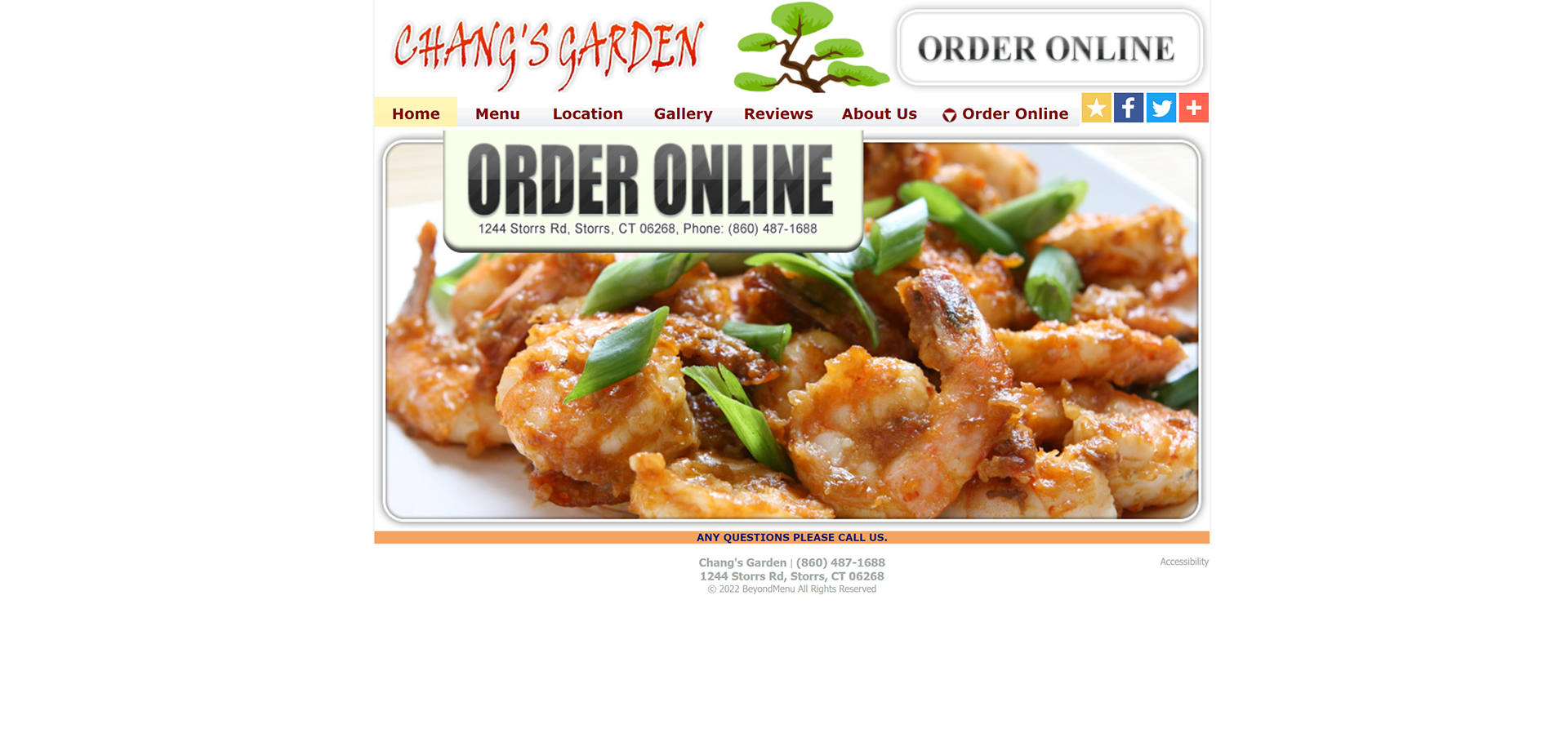
Original Home Page
Chang's Garden mentioned that many of their customers had trouble ordering their food through the phone if they weren't familiar with the menu offerings. They would get many calls but spent most of the time explaining what a dish was or how big the portions were, which slowed their ability to take in more orders.
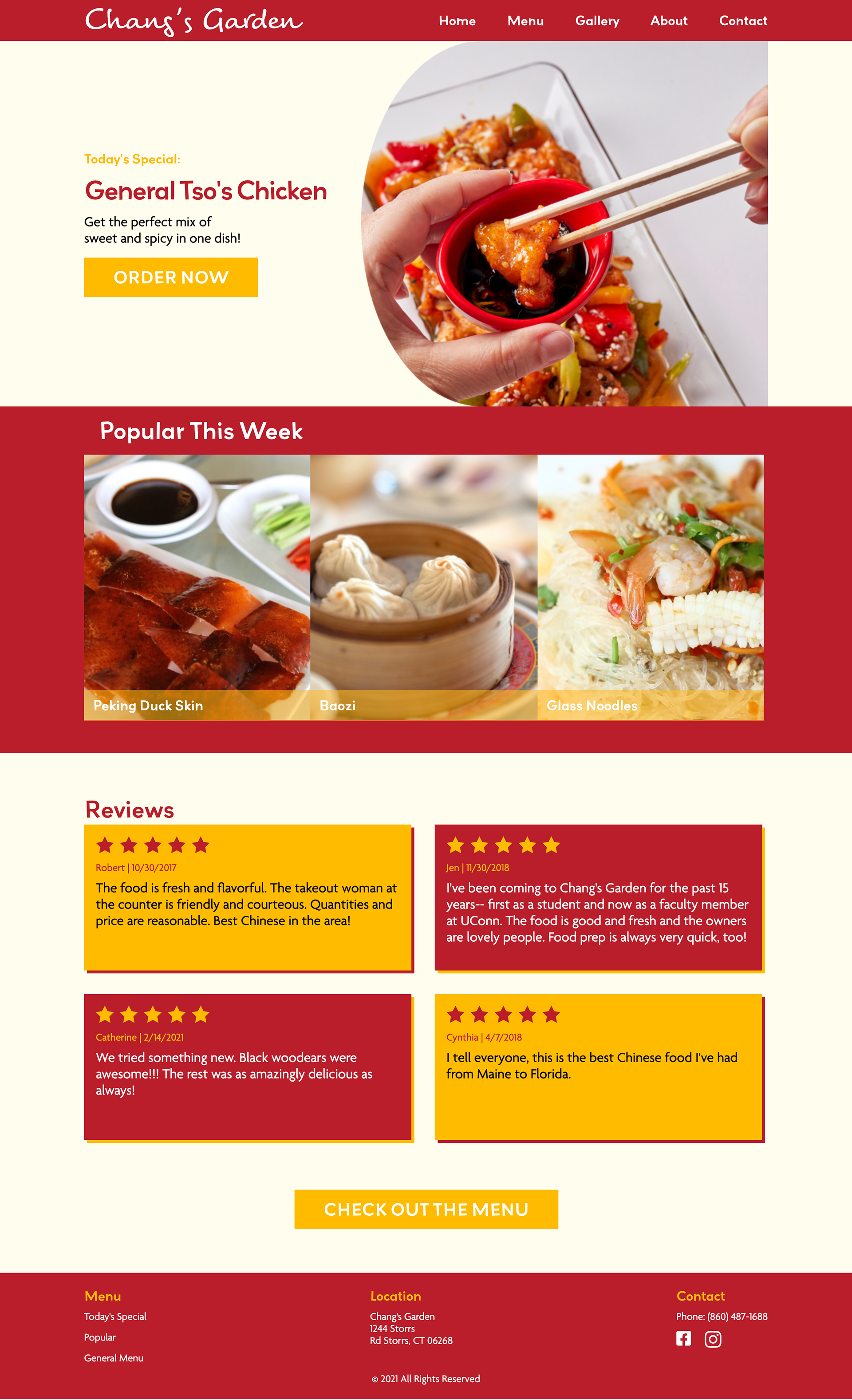
New Home Page
1. Today's Special
During the interview with Chang's Garden, I found out that they have a special menu item each day specially prepared by the Head Chef. This very key information was not present on the original website, so I added this section to allow customers to check what the special menu item was that day without having to call the restaurant to find out what it was.
2. Popular This Week
Based on personal experience when in a restaurant, I get overwhelmed by the amount of menu items with words that I don't understand, especially if they don't have images of what the food looks like. So, to make it easier for other students that visit this website (less than 10% of UConn's student body is Asian), I decided to include a "What is popular this week" section that includes pictures so that people that have Chinese food for the first time can visualize and start learn of the menu items.
3. Customer Reviews
This review's page was originally separate individual page. However, there was an overwhelming amount of scrolling to do to read through hundreds of customer reviews. Also, considering how I chose to promote Today's Special and what is Popular This Week, I thought it would be a good idea to have reviews right after the food section to create that immediate trust and connection.
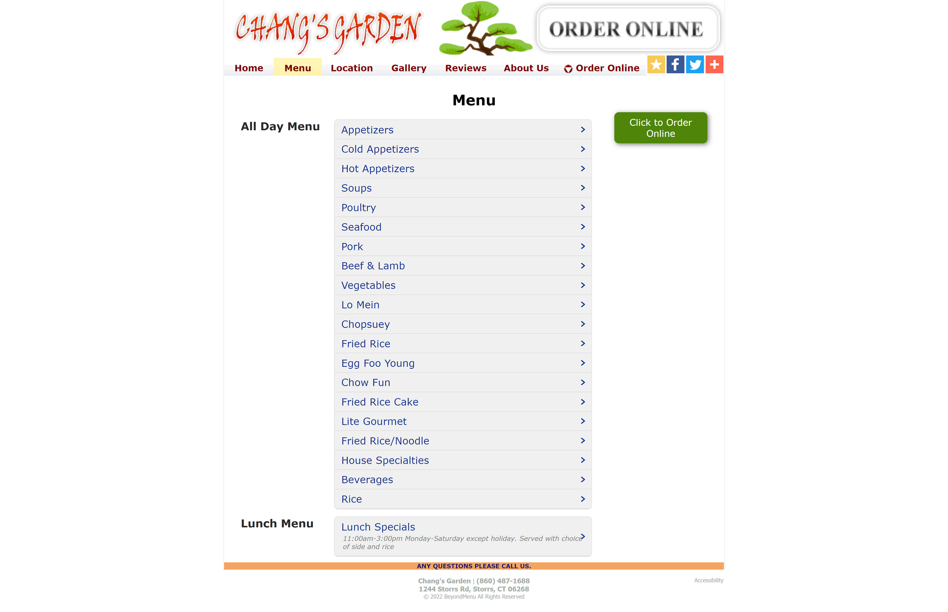
Original Menu Page
The original menu only had lists and you would have to scroll back and forth for really long lists to open up and close the tabs.
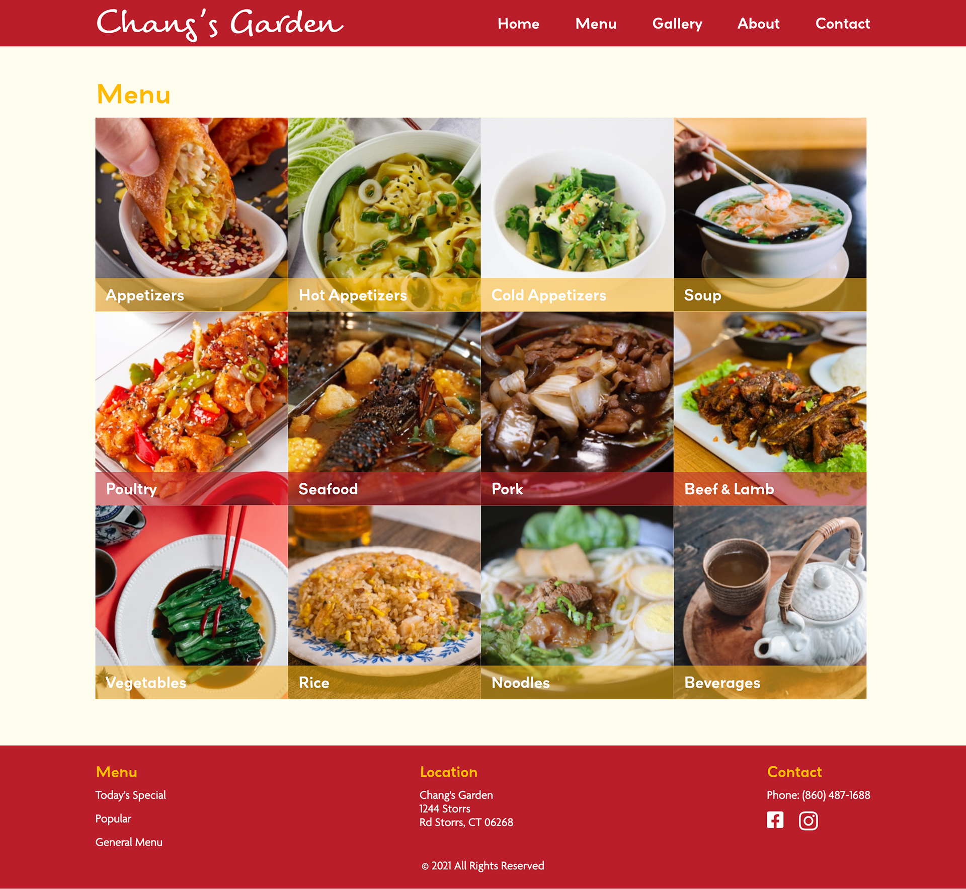
Improved Menu Page
1. Recategorizing
As we can see from the original menu above, on the menu category alone, there were a lot of categories to choose from. What was interesting is that there were some menu items that were stand alone foods such as lo mien which could be under noodles, poultry, seafood, pork, etc. So instead of having those stand alone menu items as a category, I thought it would be better to have the type of meats as a category with that type of food under it. This not only helps tidies up the categories, but also helps the users be less confused when there are duplicate menu items.
2. Images
Quite often I find it very useful when restaurants have images even for well known dishes because I always get names of food confused. Knowing that not everyone is familiar with Chinese food, I thought it would be a good idea to enhance the visual cues for the customer to understand what they will be ordering.
Original Gallery Page
Surprisingly, for a well known and established restaurant, they did not have any images in their gallery. However, I didn't just want to add any images, I wanted to add images that would tell a story such as what kind of people go to this restaurant and what makes Chang's Garden unique.
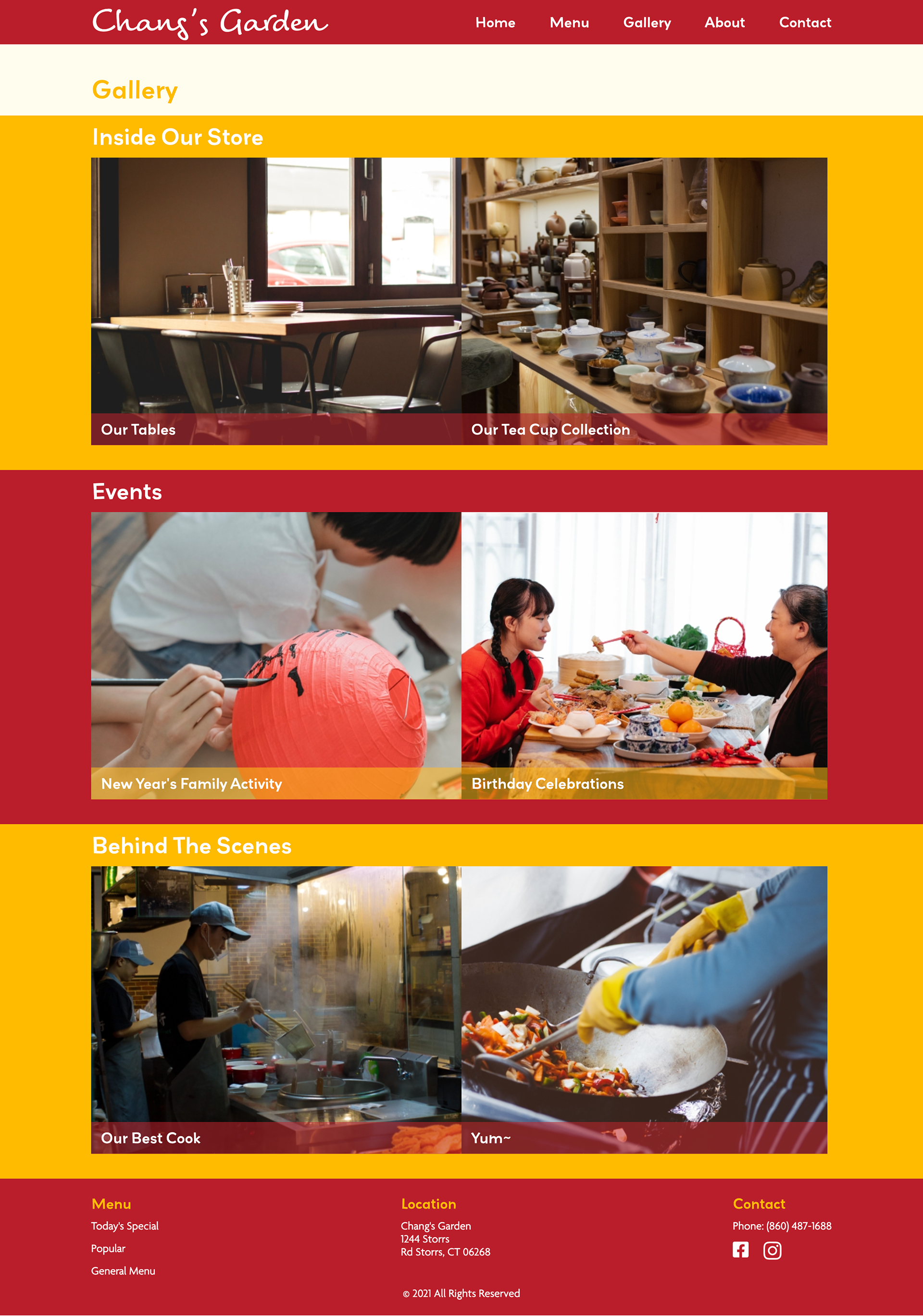
New Gallery - Where Images Tell Stories
1. Inside Our Store
Some times it is not about the food. Some times, there is a certain vibe to the restaurant that makes us feel a certain way. Chang's Garden, which has been one of the oldest Chinese restaurants in Storrs, has a collection of tea pots and warm wood aesthetic, making it feel nostalgic and cozy as you enter the door.
2. Events
Further inside the store, they have special private rooms that are bigger and more modern for parties and events that they host throughout the year such as writing your wish on a lantern for new years, birthday celebrations, and more.
3. Behind The Scenes
Although not everyone really cares about who the chef is, there are always people who appreciate the detail of being informed who made their food. Especially with Chang's Garden's excellent chefs and clean kitchen.
Original About Page
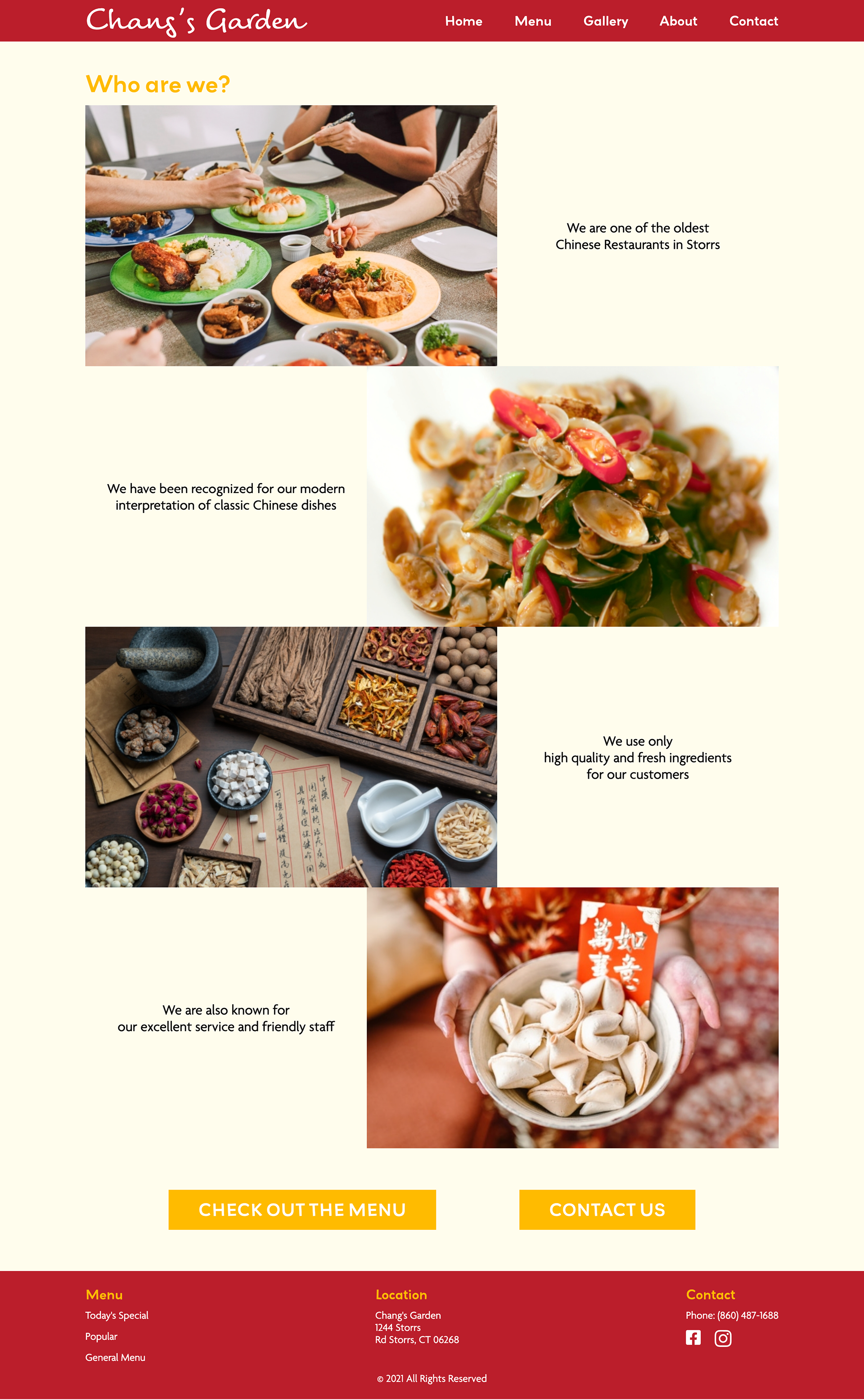
Chang's Garden about page is very minimal, getting to know what their "modern interpretation of classic dishes" look like, and what other things that make the restaurant special would be nice to show off proudly.
About - Chang's Garden's Story
1. Restaurant Highlights
This about page simply puts what is already mentioned in the about page but in a more visually appealing way.
2. Call To Action
Perhaps after learning more about the restaurant itself, people would be interested in taking another look at the menu. So, instead of having to scroll all the way back up, I left button that links tot he Menu and another that links to the Contact page.
Contact Page
Basic Information With Added Navigation
The contact page was mainly a redesign of the same elements. I added a button to order online, and another button to view the menu. Although this might seem redundant for a simple website, I thought it would help users find what they would go to the contact page for, which is to order and ask questions about the menu, much faster.
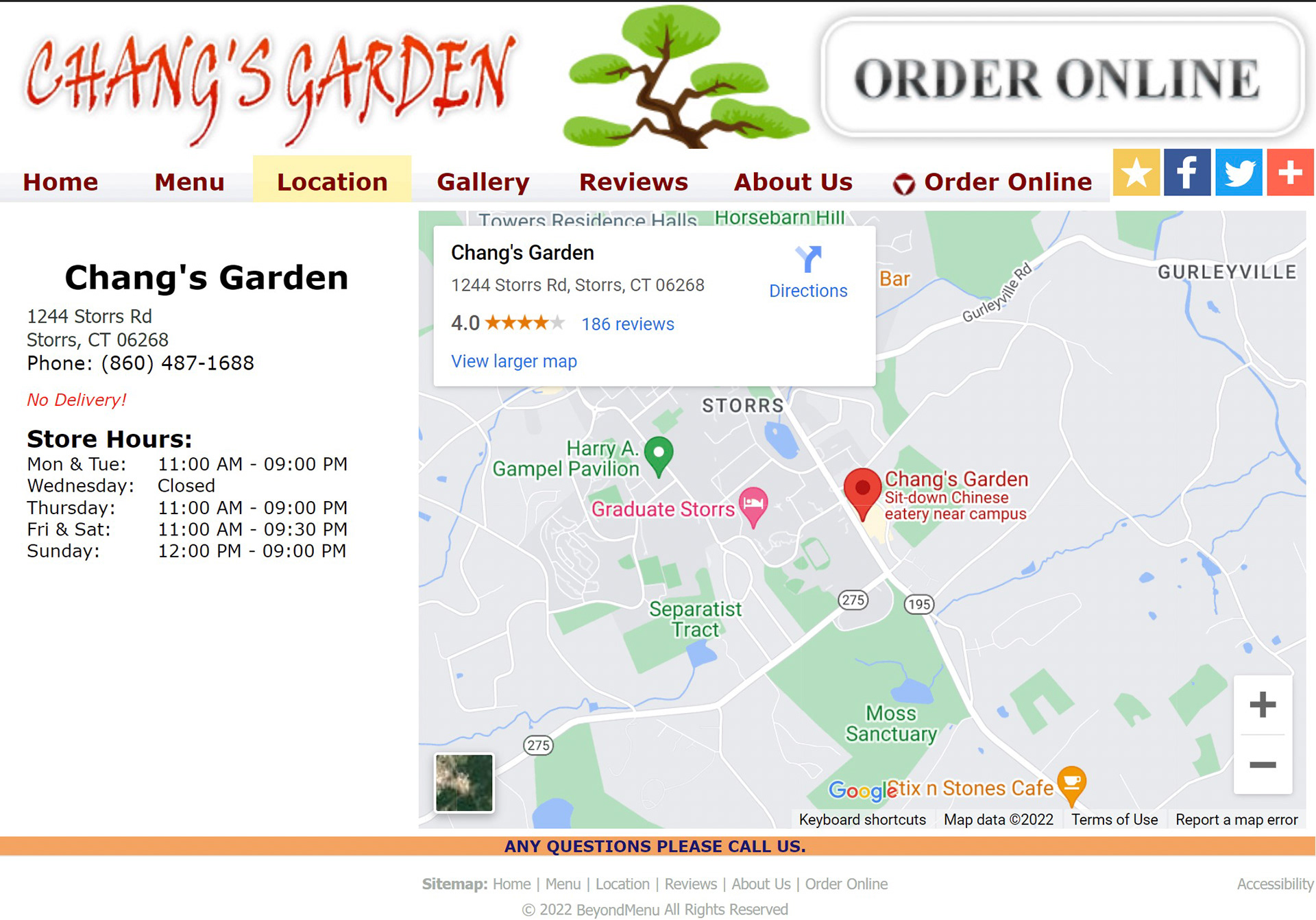
Contact Page - Original
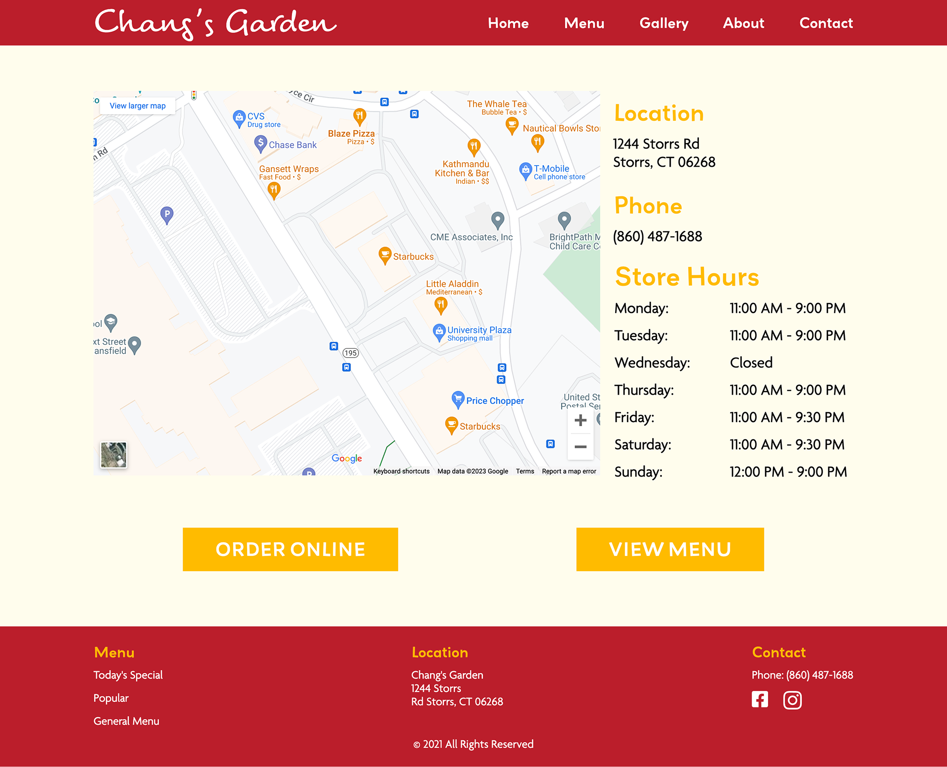
Contact Page - Redesigned