
Logo before redesign
Project Background
A spiritual gap year program located in Europe had renamed from EMP to Empower, yet, people still called them EMP even a year later, and they were having trouble because their original logo was not flexible to be used in different platforms.
After our first video call, I got familiar with Empower and its mission. Together with a David, the Co-Director of Empower , we concluded that a new visual identity is what Empower needed. However, we would first start with the logo which should entail the following:
- The new logo should represent Empower and its mission.
- It must be a versatile design that can be used in multiple mediums and scenarios.
- The logo should evoke a sense of inspiration to young adults between ages 18 and 30 to "bring light to others."
Project Restrictions
This project's ONLY focus is the logo itself, so it will only be presented in black and white. Use of color and how it is used in the context of Empower as a whole is out of scope, and will be explored in the visual identity phase.
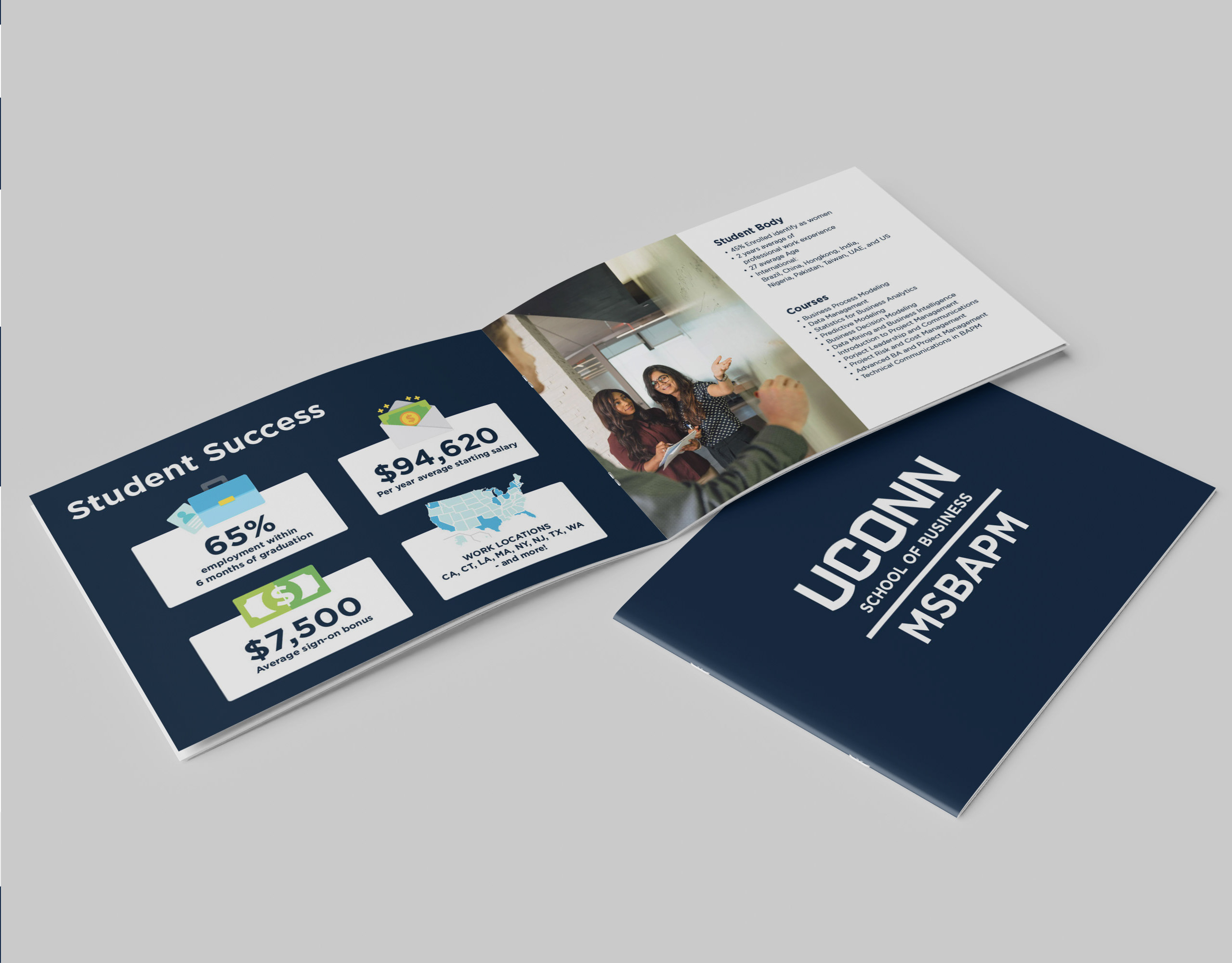
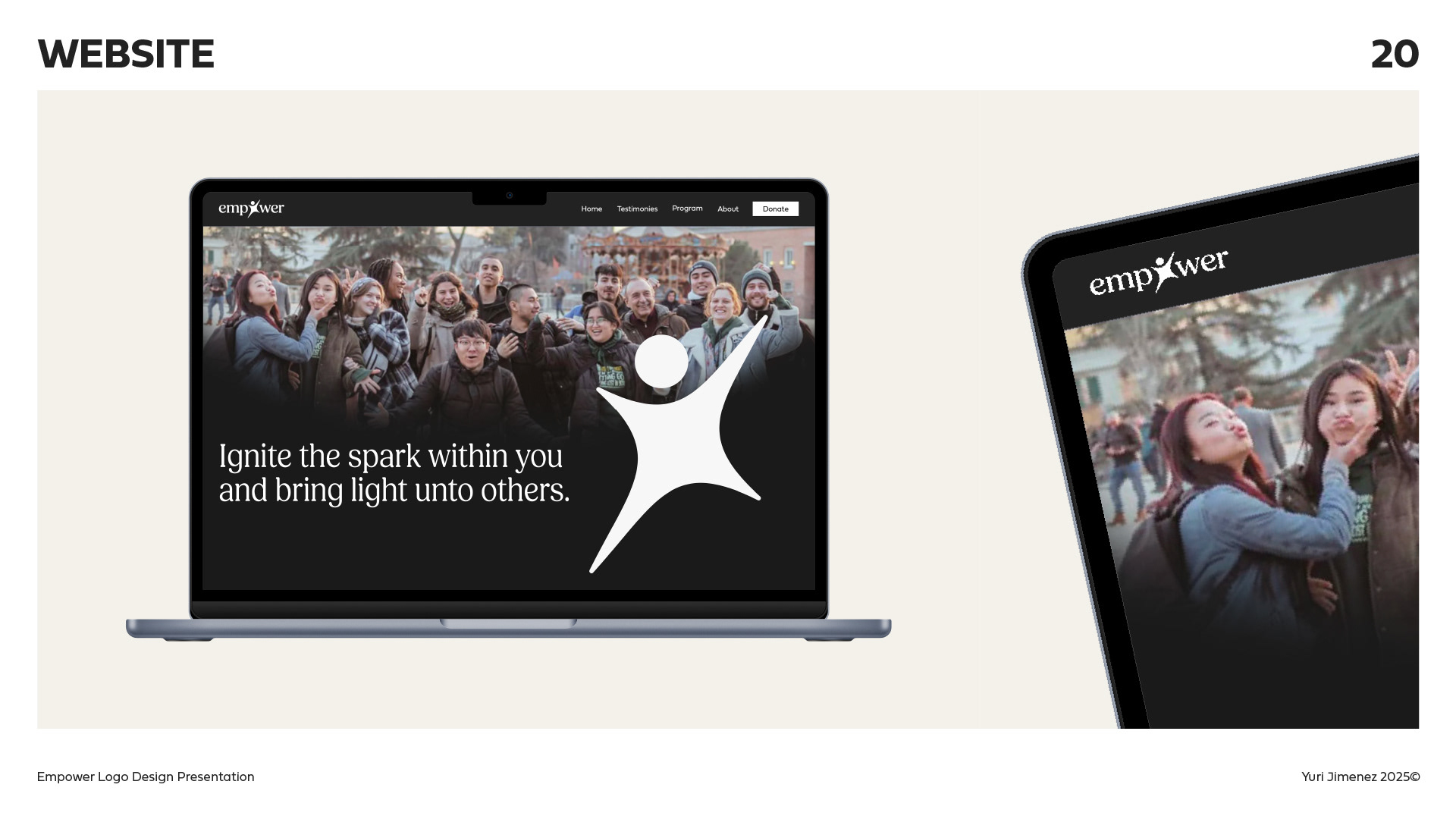
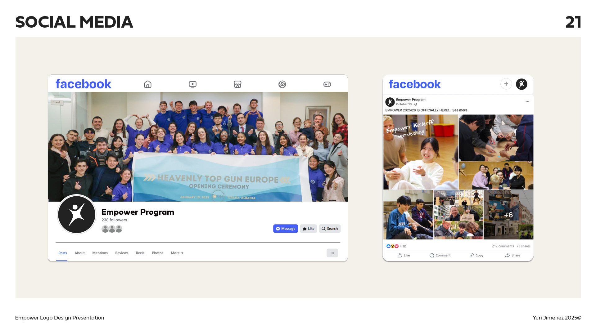
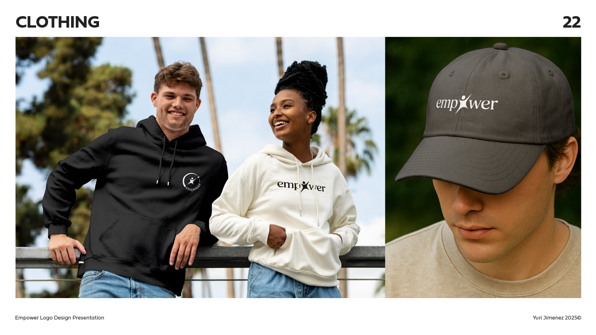
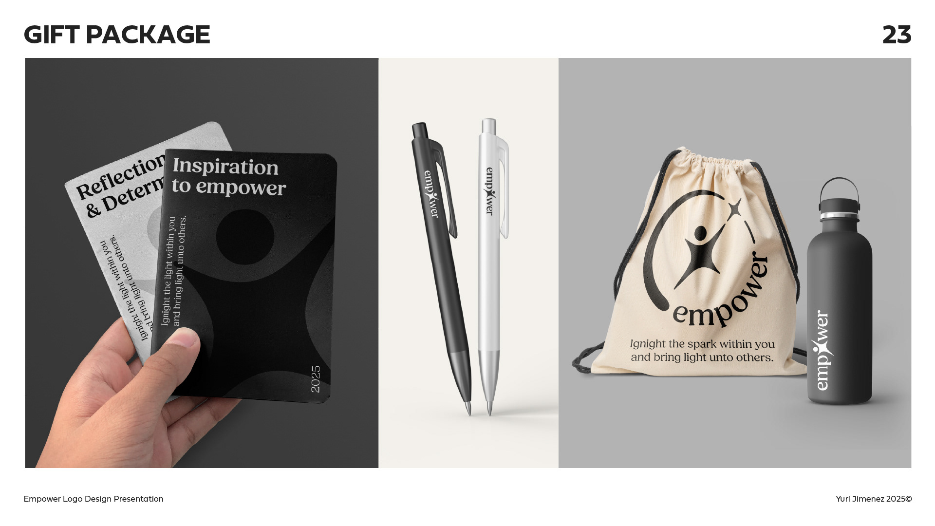
Logo In Play*
*As this project focuses on the logo itself, all mockups are presented with the logo in black and white. These may not be the final colors after I go through the visual identity phase with Empower.
Behind The Logo
Inspiration
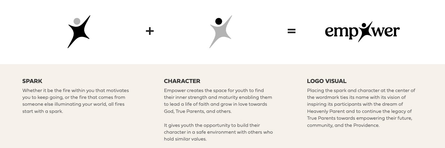
Inspiration for the logo came from a talk I had with David, the Co-Director of Empower where he mentioned that "through the program participants can feel like it is a new start and new beginning..."
This made me think about stars, where many of the elements were and are created. Then I decided to put a circle on top of the star, making it look like a person, serving as a reminder that Empower is where people that "bring light to others".
Keywords and Mood Board
Confident
Approachable
Inspiring
Light/Bright
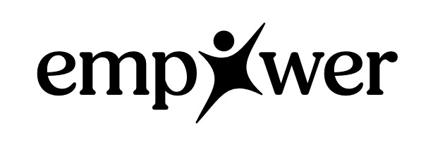
Description
Empower’s logo evokes a sense of hope and excitement. Its traditional typeface design reflects a deep connection between the past, present, and future. Additionally, it offers a welcoming tone that encourages anyone to feel empowered.
The “O” at the heart of the logo represents the guiding light that is within each of us, serving as a reminder that the more people we inspire, the brighter we all shine together.
Logo Breakdown
Logo Detail 1
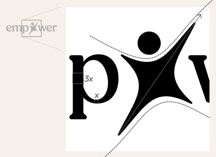
Asymmetry and Angle
Asymmetry in the star creates dynamic movement and elicits joy and excitement.
It is also angled towards the top right corner symbolizing continuous growth and commitment.
Line Weight Variety
The typeface with different line weight carries on that dynamic throughout the whole logo mark.
Logo Detail 2
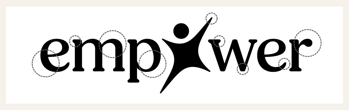
Lowercase Letters
The use of lowercase letter brings balance and harmony to the design, and directs its attention to the word's positive associations while also offering an inviting tone for one to be part of "bringing light unto others."
Circular Shapes
Circular shapes conjure warmth, friendliness, and approachability. Together with the dynamic shape of the spark, it hints at the fun activities that the participants can look forward to during the program. It also denotes aspects of community, reach, and service.
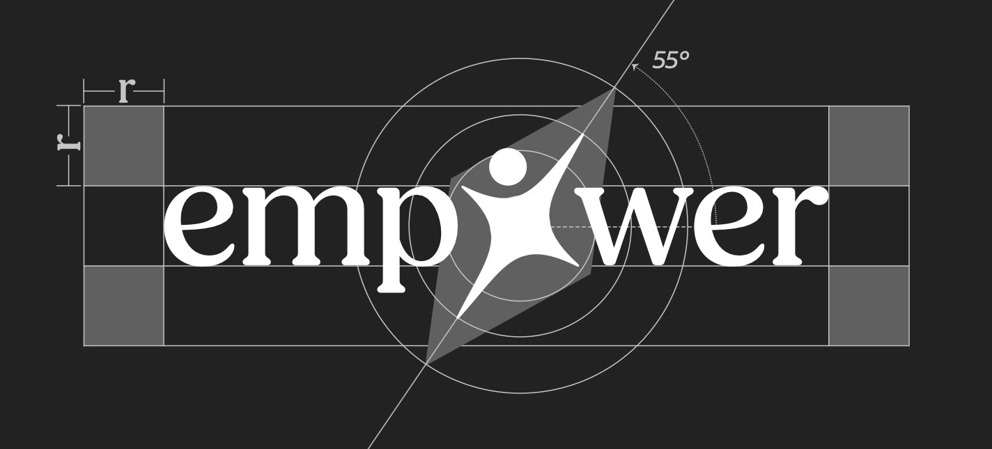
Grid
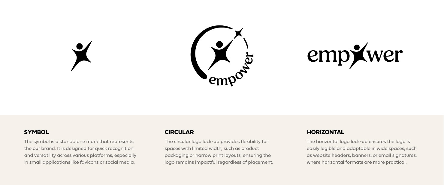
Lockups
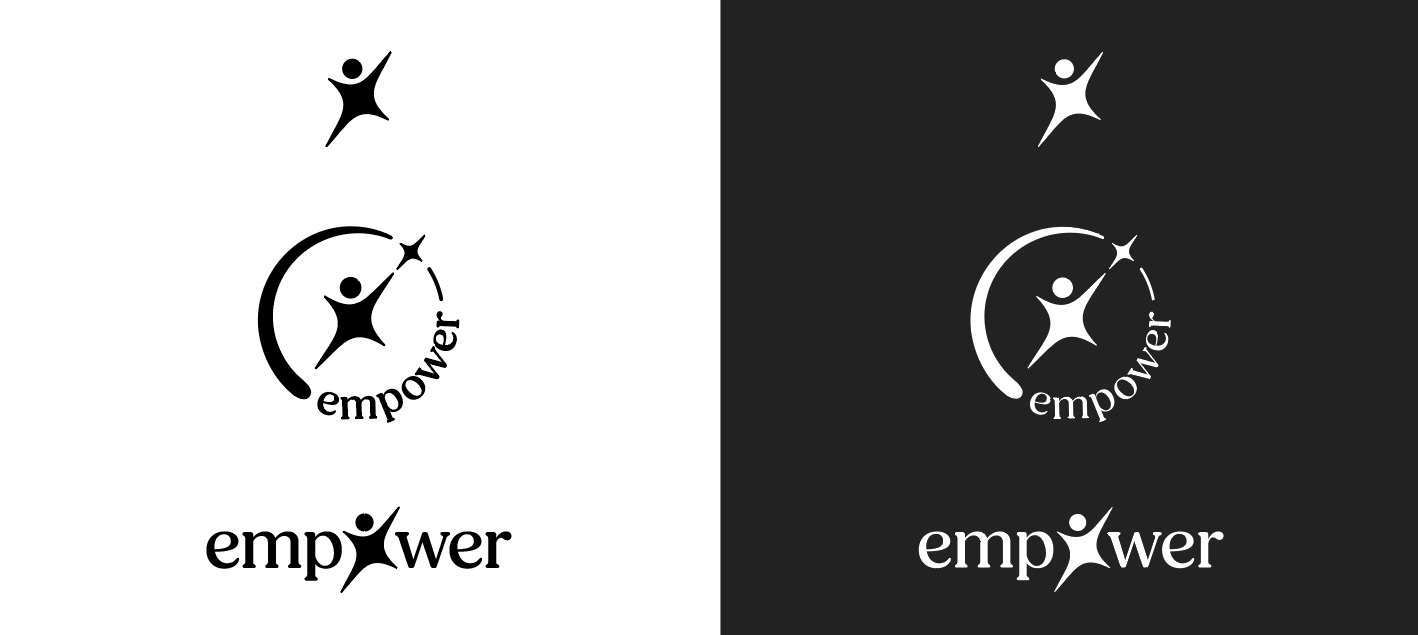
Black & White
Logo Animation