Project 1: Branding
When we first met InnerView, it's main focus was on its Flagship Course: Not Just a College EssayCourse and its focus was on high school students. However, they also wanted to eventually expand into a coaching platform catering towards young adults. Ellie and Mike, the co-founders of InnerView, were also looking into other growing opportunities which lead us to conclude that they needed a new branding to position themselves ahead of time for their vision of to bring more humanity, connection, and student-empowerment to our system of education."
Project Overview
1. When we first met InnerView, the first thing we noticed was that their branding was inconsistent.
- Some times they would call themselves InnerView or InnerView Education
- Use of different colors and fonts for their logos
- Their tone of voice was different across each platform
This made us feel very confused and unsure if they were all the same startup until we saw their website that had all their links to their social medias indicating that they were indeed all InnerView Education.
2. Another important thing to note is that InnerView Education wanted to expand from helping high school students with their college applications. We talked about several ideas such as having a Not Just A Financial Course, or even creating a mentorship platform catered towards young adults.
For all these reasons, I suggested that before we even work on the website, we should work on creating a brand for InnerView Education to really be able to reach to both their current and future audience.
Concept behind the original logo
Mike and Elie, the co-founders of InnerView, have had various teaching experiences. One of the most memorable for Elie, was meeting with the 14th Dalai Lama in India and how he talked about peace from knowing who you are. As one of InnerView's slogan: Know Yourself, Show Yourself, Grow Yourself, Elie thought it was perfect to bring the lotus which is the buddhist symbol for being able to become someone beautiful despite all the mud or corruption that there is around oneself.
Although this was the initial idea with the logo, there were several things that we thought were not very well communicated:
1. All the students from the Werth Institute that worked on this project didn't read the lotus flower at first. This may be due to the fact that we have never seen a dark navy blue lotus, and are not as familiar with the Eastern meaning of the flower.
2. Some of InnerView alumni have mentioned to Elie and Mike that they misinterpreted the logo and read the "i" in the logo as the private area of a women rather than the letter itself. InnerView is an educational platform for college preparation, and does not want to be associated with sexual content. Thus, it was clear that the logo needed a change.
3. InnerView uses a capital I and V in the word mark, but "i" in small caps in the monogram. This inconsistency makes the logo less versatile as they would always have to be used together so that people eventually learn to recognize both as part of the same company.
4. InnerView's name is often inconsistent across all social platforms. Some times it would say InnerView or InnerView Education. Also as mentioned earlier the word mark is used
Grow Your Wings To Freedom
Branding Concept #1
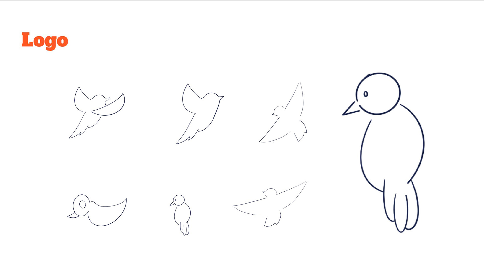
Logo Iterations
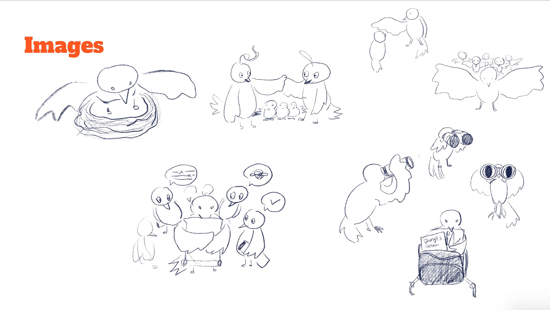
Illustrations for the website
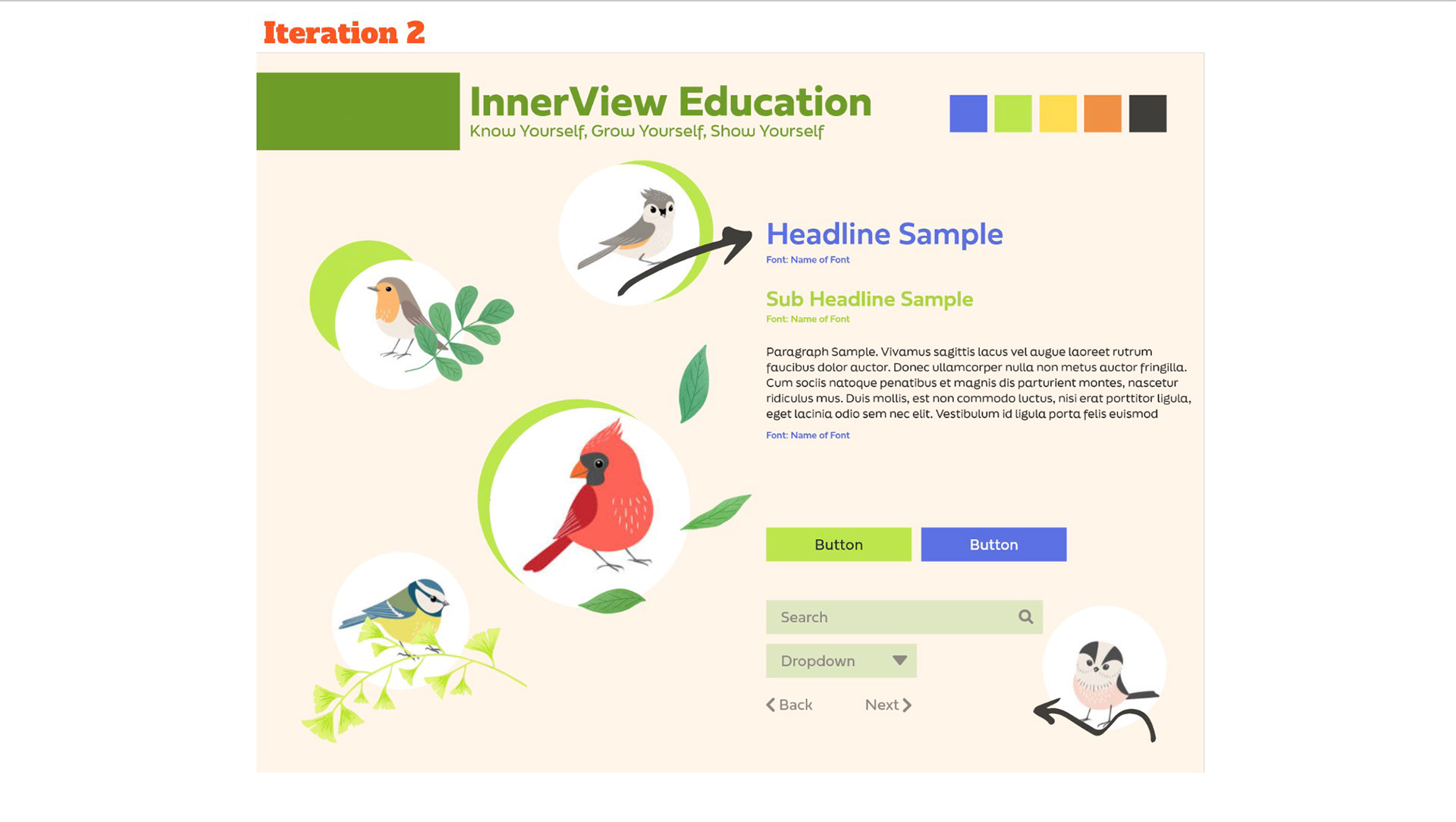
Website style guide
Logo
As InnerView wanted something that would emphasize how after the program, you will come out with new skill sets to face the world and will be free to overcome any challenges that come at you. The first thing that came to mind when I heard this was "free as a bird".
Illustrations
Alongside the bird logo, I thought that a whole image identity could be implemented. It would be fun for kids to go through the illustrations and immerse themselves with the content offered in the website.
Style Guides
Finally, I came up with a style guide for the potential website. The leaves would be used as flow lines to guide the users eyes around the website, the birds would be used as user avatars representing a individual students, and there would be arrows similar how they are used in notebooks to draw attention to important information within the website.
Beauty that Emerges
From the Mud
From the Mud
Branding Concept #2
The Logo
For the second concept, we went back and played around with the idea of the original logo since that is where InnerView started. As mentioned earlier Elie thought it was perfect to bring the lotus which is the buddhist symbol for being able to become someone beautiful despite all the mud or corruption that there is around oneself.
Around the time that I started working on this logo's concept, InnerView was thinking of working on a new project where they would expand their product line not just for high school students but also for young adults; they thought about creating another sub-brand for a coaching platform. Considering this and combining the story behind the original logo, I made a new logo concept that was more modern and would speak to a wider audience.
The Branding
After coming up with the logo, everything else about the brand came in really easily. The waves from the logo (that symbolize how InnerView students can merge from the mud and push away corrupt thoughts) helped me choose the font as well as the shape language that eventually combined to create other design elements.
The way in which I chose the colors started with wanting to keep green as the main color but making it feel more like the darker color of the lilipads that grow near by where the lotus flowers grow. From there, I wanted to add a color that would pop and bring out my inner childhood so I chose the primary colors: yellow, blue, and orange (red variant). The reason I went with Orange instead of red, was to create contrast with the blue as well as not making it look too elementary and young since our audience is high school and not primary school.
Sunflowers Shine
Branding Concept #3

Original Drawing

Illustration Iteration

Logo with dark green background
Logo
Elie mentioned that he really liked the direction we were going for with the lotus flower. However, Elie felt that he wanted something that was made by the students for the students. For his Not Just A College Essay Course, he asked one of his students to make illustrations for some of the pages for the course book. For this reason, we looked over the past drawings made by the student, and collectively decided that a sunflower that the student drew best reflected InnerView's students and what InnerView is trying to achieve.
We ended up using the brand guide of concept 2, but replacing it with the logos from concept 3
As Elie and Mike really liked the new branding that was already done, the only thing we decided to change was the logo that I created to the using the sunflower by the student to create a new logo for InnerView. Some changes I made were to make the logo fit a 1:1 ratio, make the sunflower fuller, and changed the colors slightly to fit the branding guide that I have made before
[I will add a few images of the website, social media posts samples, and other mockups from the final concept]
