Project Background
As the University of Connecticut (UConn)'s School of Business was getting ready to welcome new potential students for the upcoming year (2023 - 2024), they wanted to update their infographic to reflect the latest statistics they had about their MS in Business Analytics and Project Management (MSBAPM) program.
My design became the primary template that other schools within UConn started to use to promote their programs as well.
In addition to the infographic project, I also got to design the program's promotional brochure. Here the focus was more on what the program offered than statistics or outcomes, so a lot of the infographics were omitted.
I know it's a little bit of a scroll, but my process for creating this infographic is documented below the final draft if you're interested :)
Tools
- Illustrator
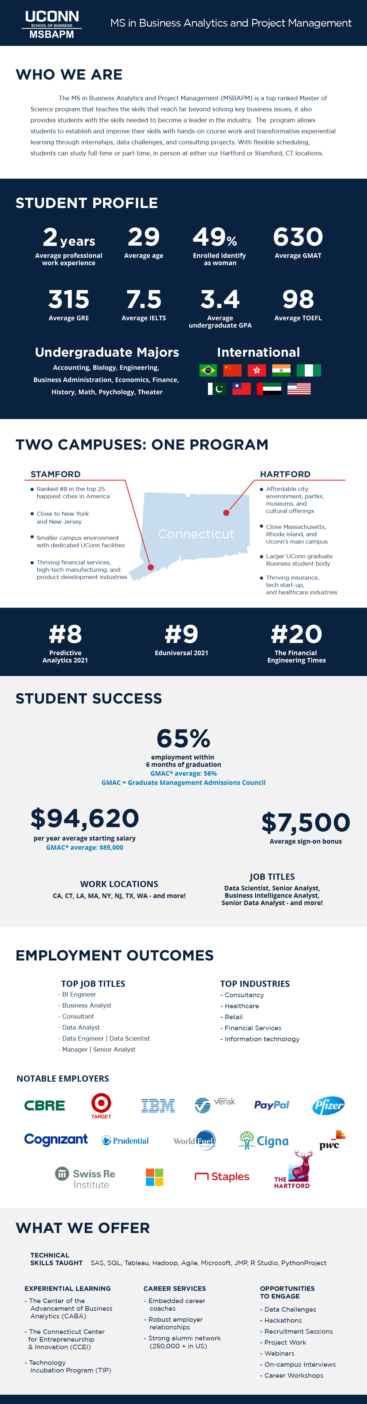
UConn MSBAPM 2023 - 2024 Infographic and Promotional Brochure
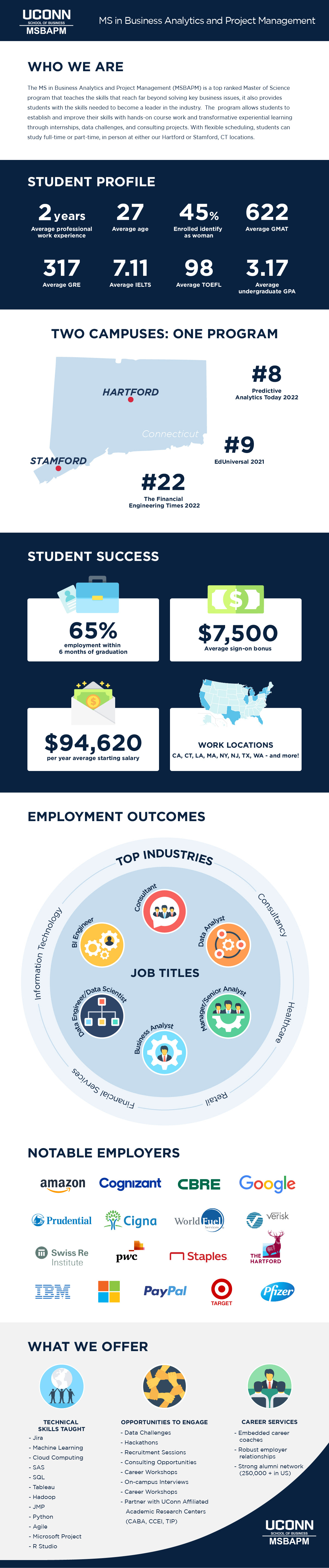
UConn MSBAPM - Final Infographic for the year of 2023 - 2024
Process and Drafts
Previous Design Breakdown
I heard about how you can learn a lot by breaking other people's design, critiquing, and then making it your own. This was my first project redesigning something, so I wanted to do exactly that.
I looked at the old infographic (image B.1) and wrote notes on what I liked and what could be improved (yes, some of my notes are in Korean because it is shorter to write some times).
Then I took references from the official brochures UConn gave out to me as a high school student with their updated colors and fonts, and tried to apply some of those elements into my new design.
Improvements
1. Something I always thought an infographic should do, is being able to distill information in a way that you can understand it at a glance. Thus, I thought it would be interesting to do some research and asked MSBAPM what information they would like to highlight.
2. I also decided to put icons and visual cues to help the reader get to the information they need to the most.
3. For the Top Industries and Top Job Titles, I thought of how jobs tend to fall within different industries. So, that is how I later came up with the circle (image A.1).
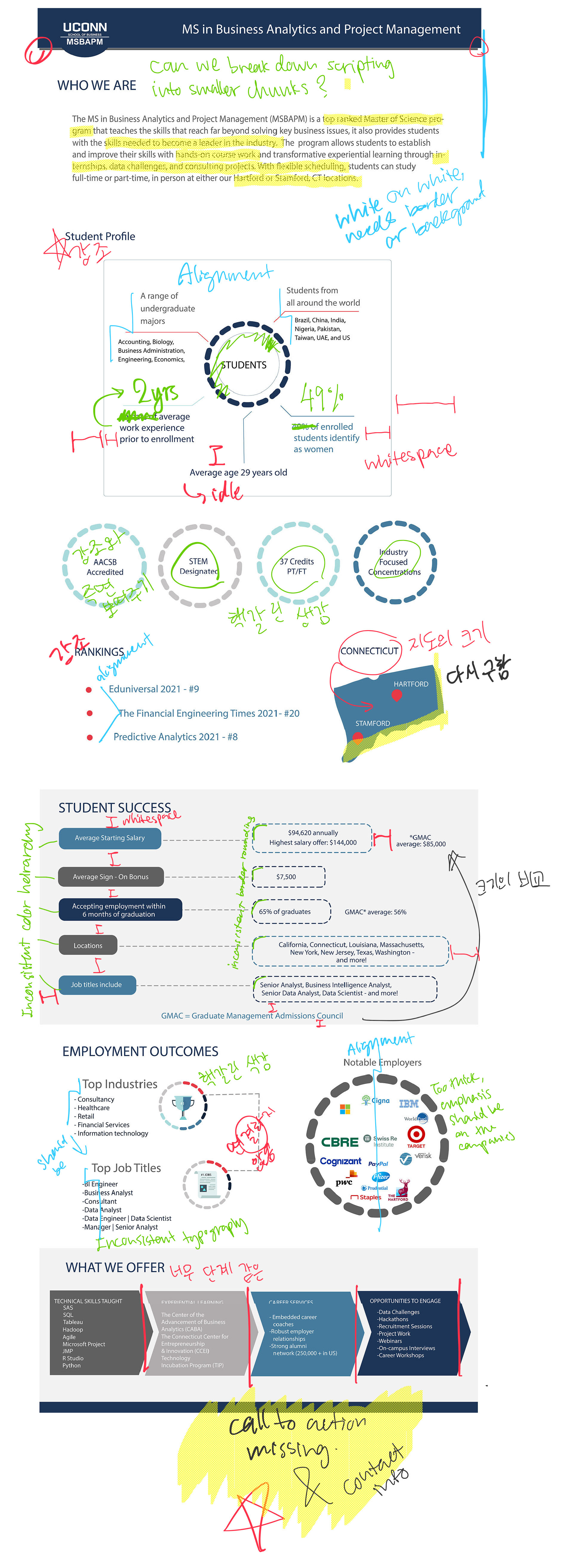
B.1. Original Infographic's breakdown before redesign
B.2. My first draft of the infographic